

Why This brand? Why me?
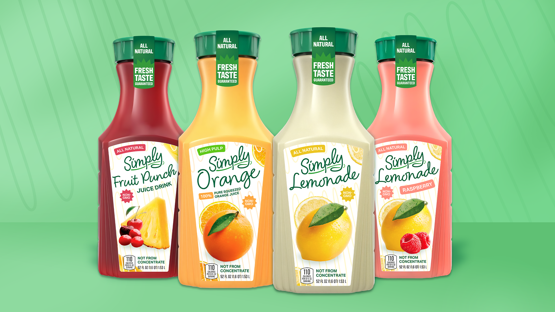
I love Simply Beverages, especially the lemonade! But when I go to the store and see all the lemonades lined up together, I feel like Simply Beverage’s branding falls short behind their competitors. Especially with other beverages now copying Simply Beverage’s drink bottle shape, it’s more important than ever that they stay at the top of people’s shopping lists.
In approaching this project, I wanted to do a “refresh” rather than a full “redesign.” My thought process was that, despite my critiques, their branding is still classic and recognizable. Audience recognition and consumer retention in this theoretical scenario is important in such a competitive market.
So let’s hop right into it!
Critiques of the Current Branding
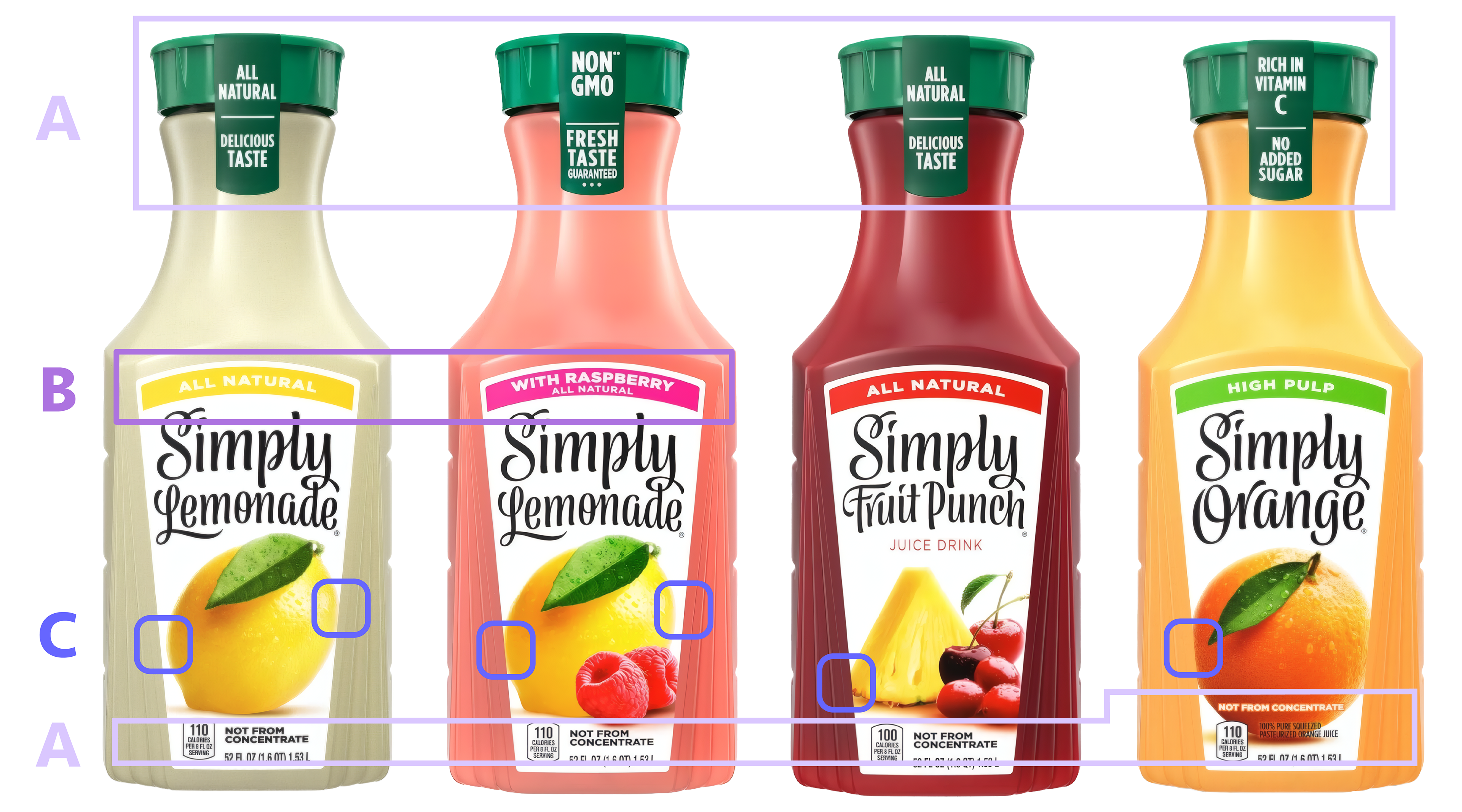
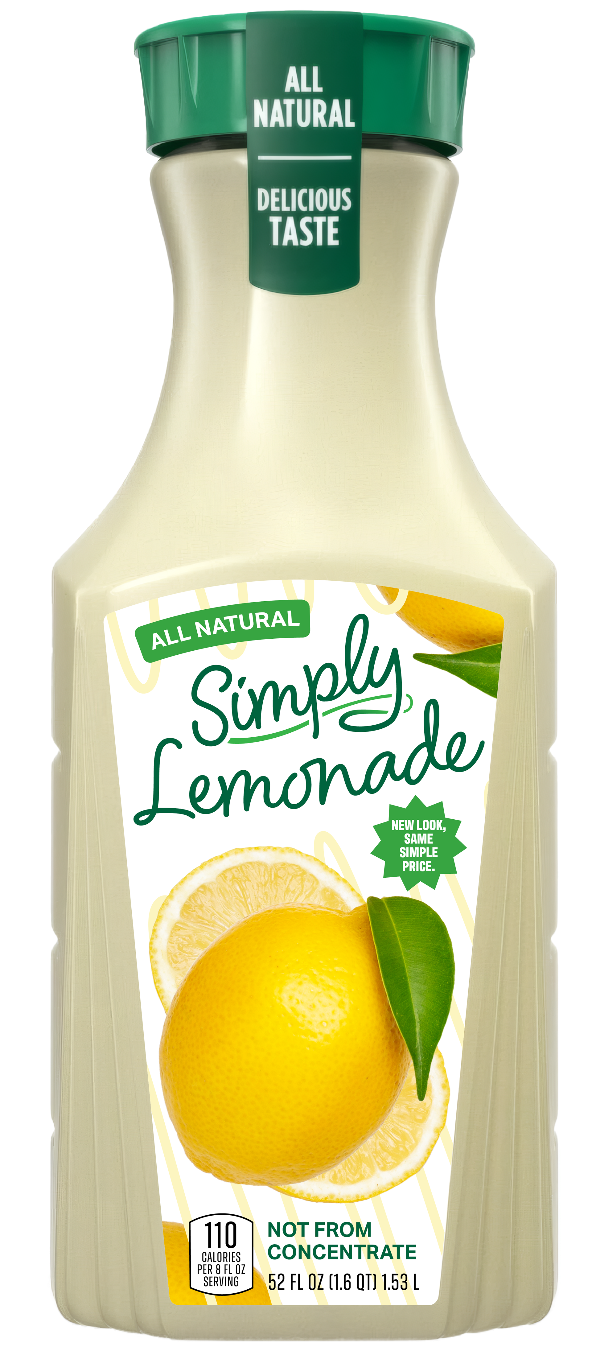
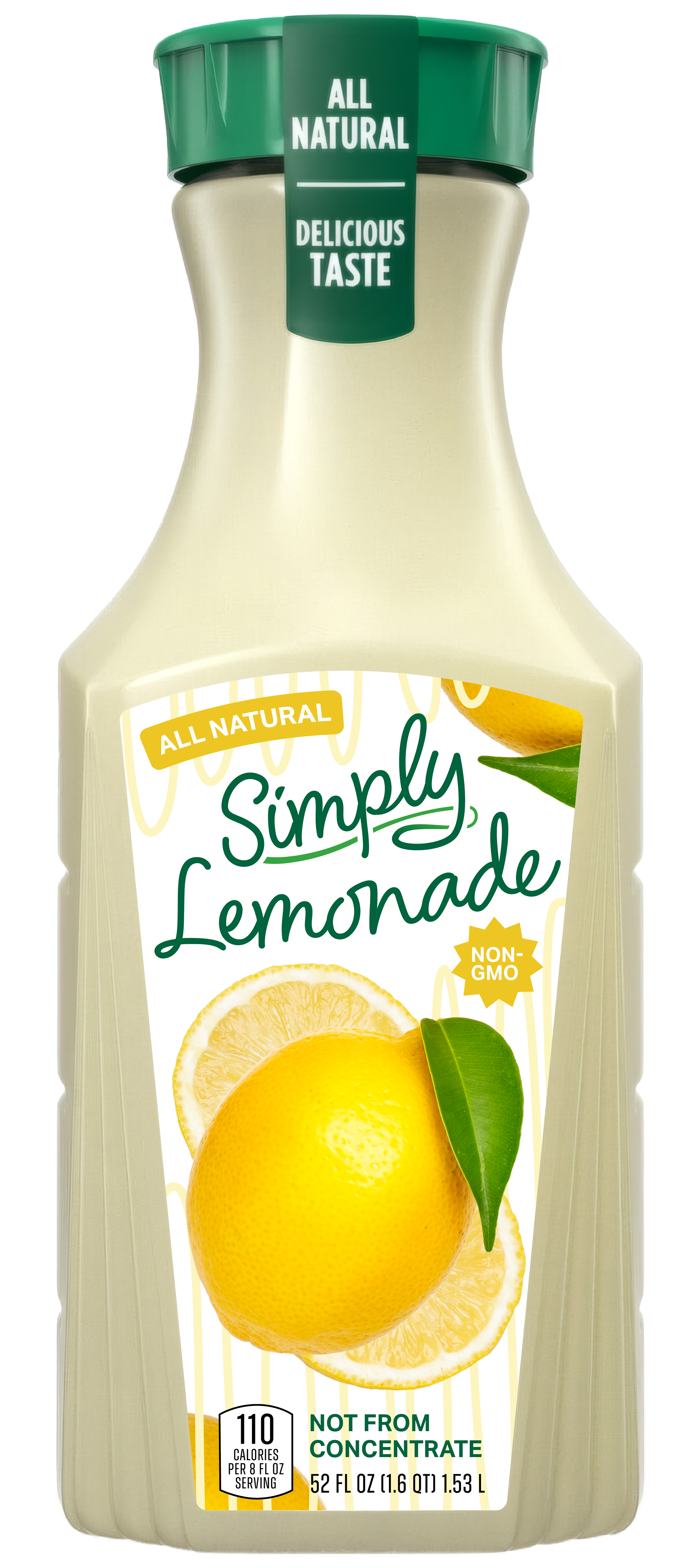
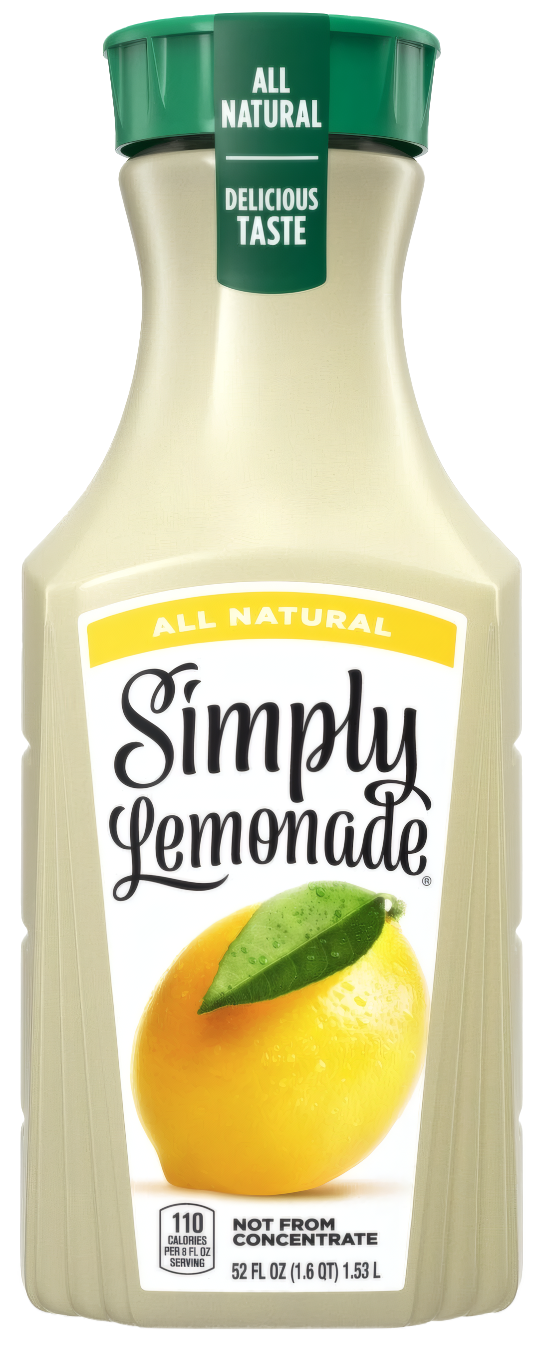
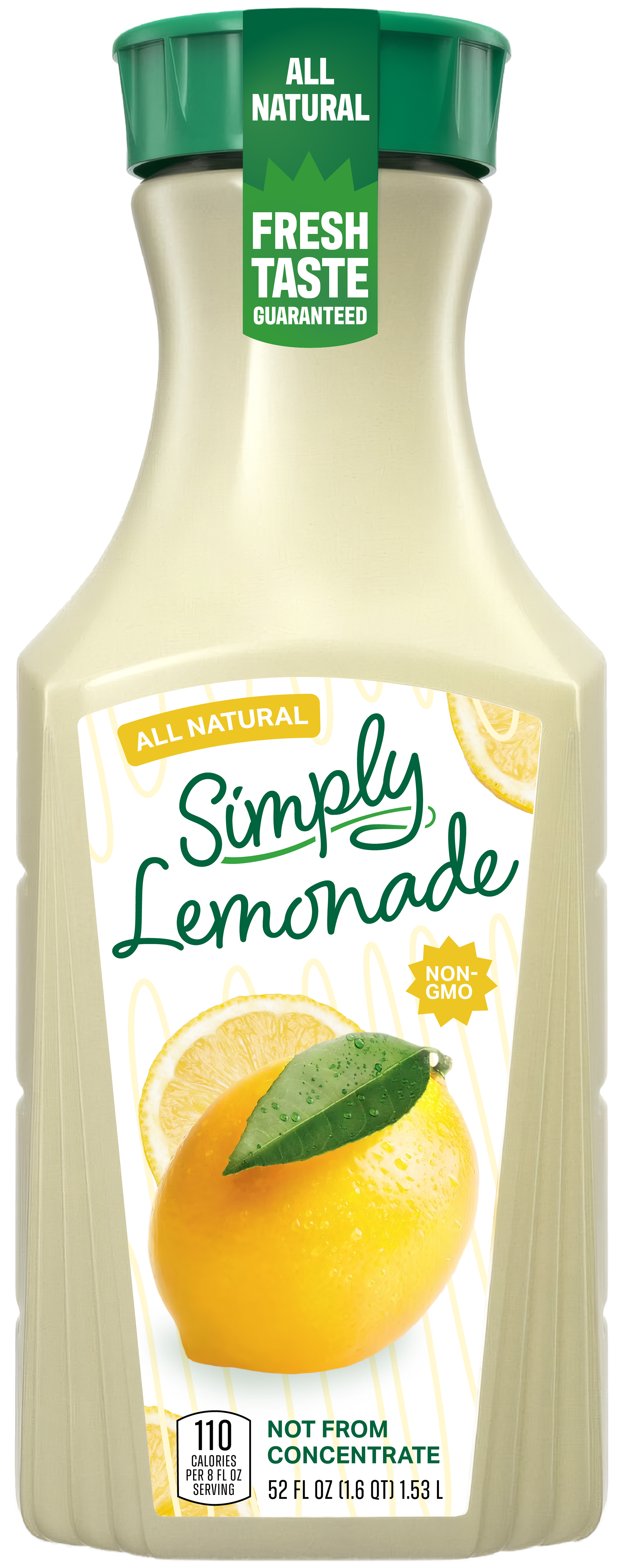
A) Inconsistent placement/display of health facts, such as "Not From Concentrate" being pulled to a different place on the orange juice bottle, or the cap stickers displaying different nutritional facts despite many of their products all being non-GMO, all natural, having a "fresh" or "delicious" taste, etcetera. The health facts similarly get lost together in their small, plain text and aren't displayed in an effective and eye-catching way.
B) The banner labels similarly have inconsistent usage, especially on the lemonade; the "With Raspberry" banner minimizes the health fact of "all natural", whereas it could be on its own line.
C) The placement and sizes of the fruit images have inconsistent or uneven spacing.
Conclusion:
> Despite being all natural and non-GMO, the branding doesn't feel "healthy" because the health facts are not displayed effectively and consistently.
> Other than the unique main font and bottle shape, the structure of the labels themselves are so simple it’s not eye-catching compared to competitors.
> There is a lot of small variations from bottle to bottle in how information is displayed, decreasing the cohesiveness and overall consistency of the brand identity.
Goals and Targets
Now with my critiques out of the way, what am I going for?
Who is the audience OF SIMPLY BEVERAGES?
> Middle class
> 18 to 45 year olds – college students, parents, working class and more
> Middle class
> 18 to 45 year olds – college students, parents, working class and more
What is the heart of the brand identity?
> Fresh tastes, simple and all-natural ingredients, great quality
> Fresh tastes, simple and all-natural ingredients, great quality
So what are my goals IN REDESIGNING?
> Don’t change a good thing, but update it to fit with the times
> Create better consistency throughout beverage labels
> Bring the health benefits to the forefront
> Needs to continue to be a household staple and appeal to a wide audience
> Don’t change a good thing, but update it to fit with the times
> Create better consistency throughout beverage labels
> Bring the health benefits to the forefront
> Needs to continue to be a household staple and appeal to a wide audience
First things first... the logo!
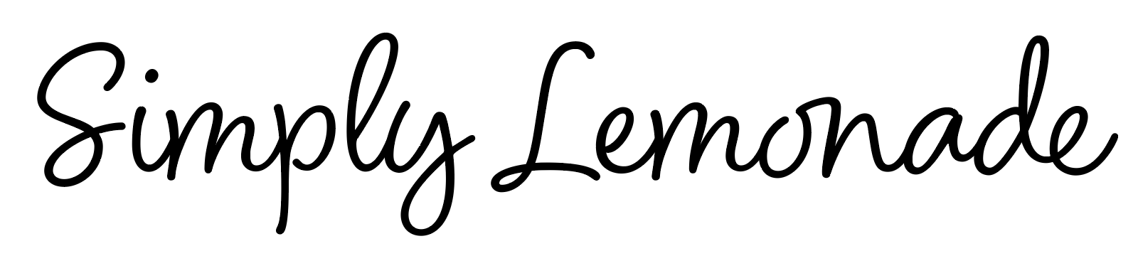
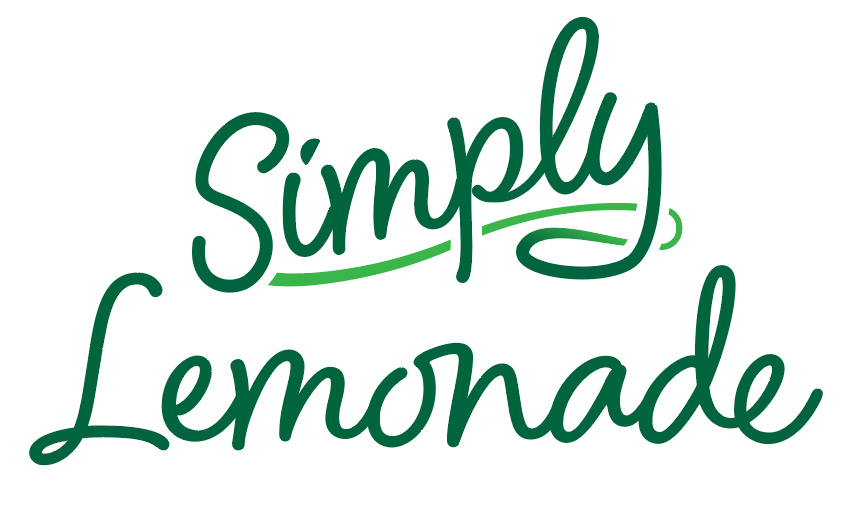
Since Simply's branding is so, well, simple, their logo choice and consequent font is one of the major brand identifiers. In approaching changing their logo, I chose to continue to have a single-font design. I used Blithe Regular as the main font, then did some edits for readability and originality.
You can see the original font verses my final logo here:
Main Bottle Label Structure
Next up I worked on the layout of the main bottle label. The labels have the same structure as the original, as I felt like that was working. In this point of the process I decided to change the main text color from black to green, since the blacks felt too harsh and the green added an organic feel. With my new additions of curvy lines to the logo, I added more fun squiggles in the back to add color to the white background. I also chose a secondary font that was more visually balanced between it's width and height.
Original
draft 1

The Colors
Green = healthy. But this isn’t just a product at a high-end store like Whole Foods, it’s at your friendly neighborhood HEB. To combat this, I changed my secondary color from green to yellow… but a darker yellow than the original, as that was much too bright for white text.
Draft 1
Draft 2

The Final Design
Finally, I created a new design for the cap sticker and replaced the lemon image with the original one, as I felt that it looked more appealing than the image I was using. I also attempted to dial back my initial design, using the lemon slices in the corner rather than the whole lemon, and also using only one slice around the image instead of my original two.
Original
Final
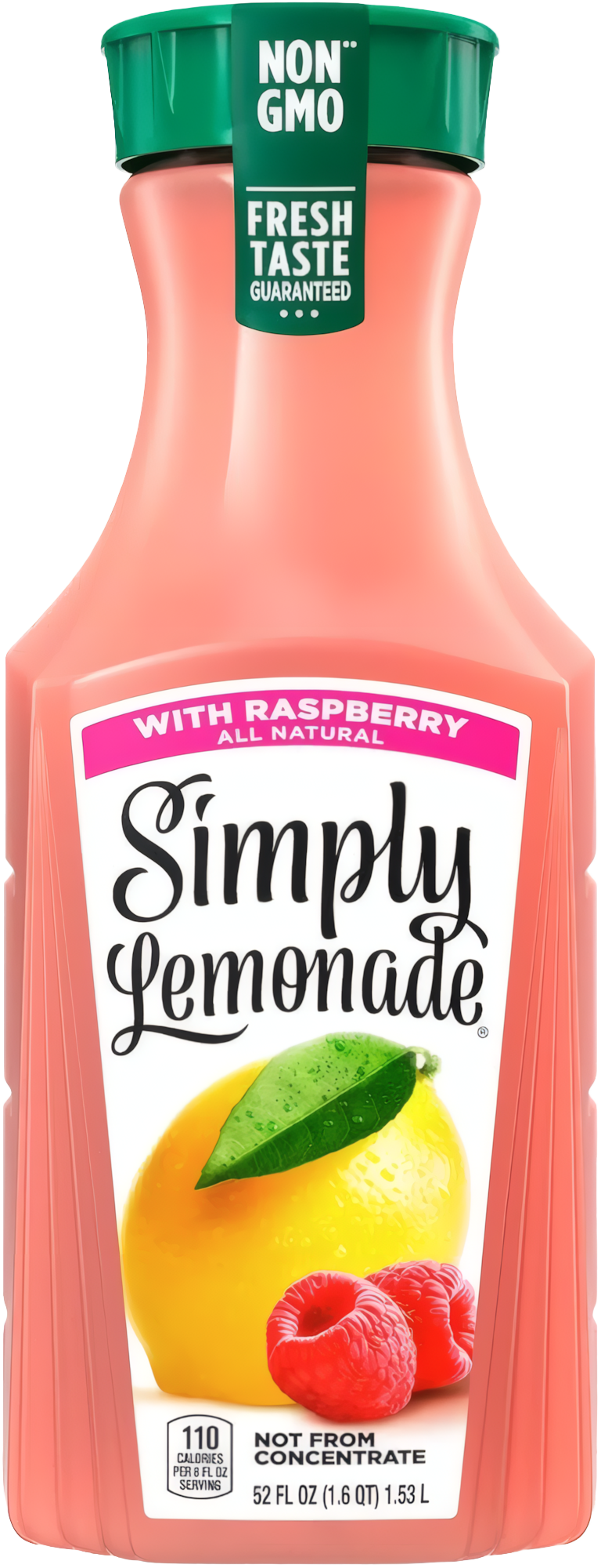
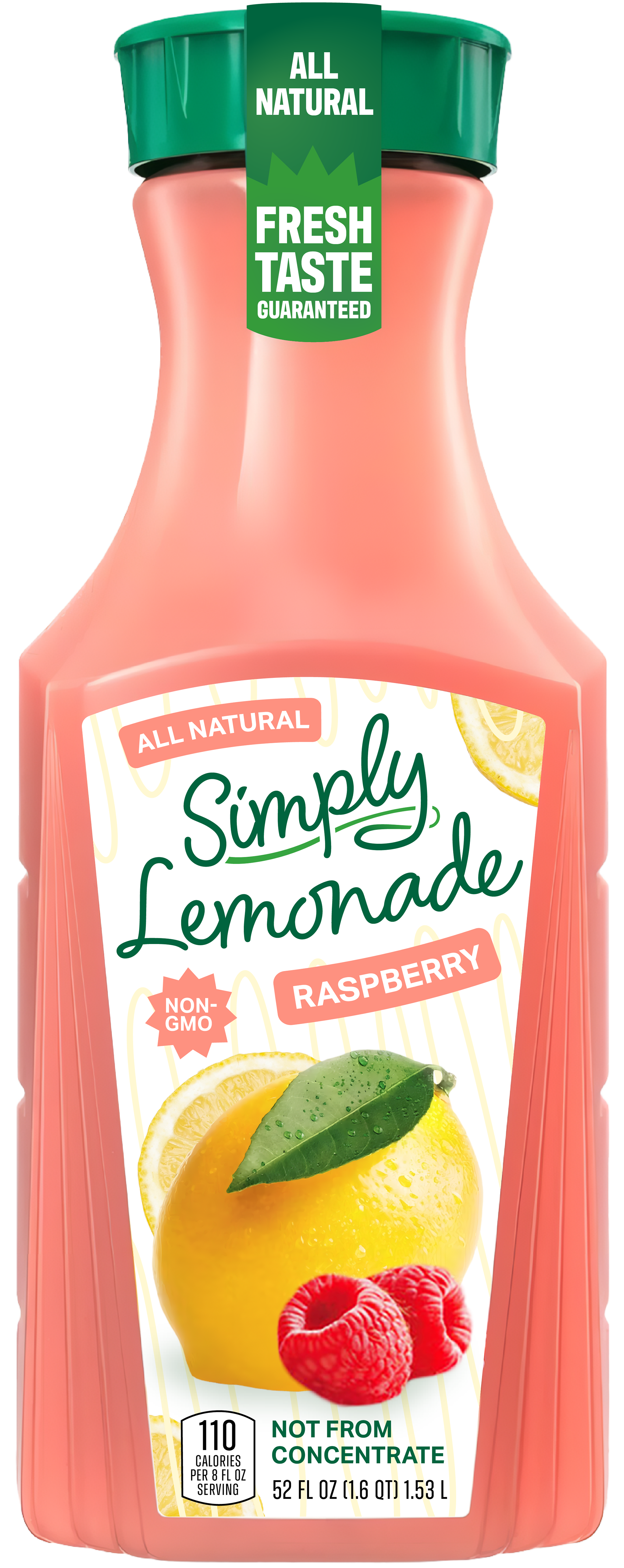
"With Raspberry"
The raspberry lemonade is actually my favorite Simply product, so you know I was excited for this one.
In redesigning this bottle, I had a few considerations. Firstly, the “with raspberry” text didn’t feel like the most efficient way of communicating the flavor, especially as the “with raspberry” was small, too far above, and unattached to the “lemonade” text. Like the yellow banner on the regular lemonade bottle, the hot pink color on the banner was distracting.
Original
final
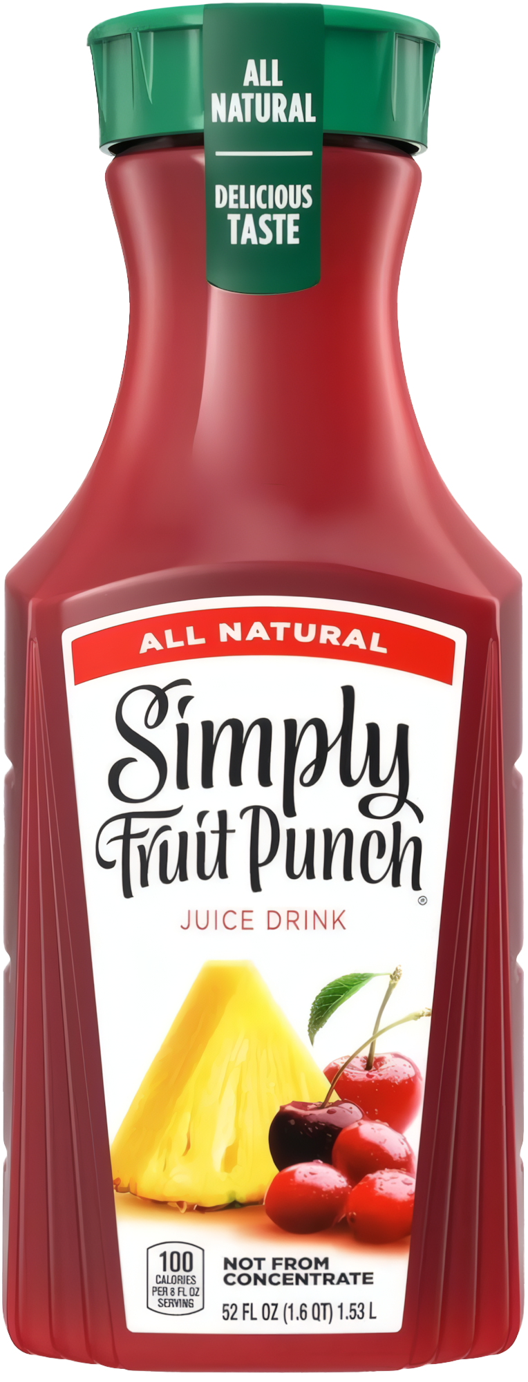
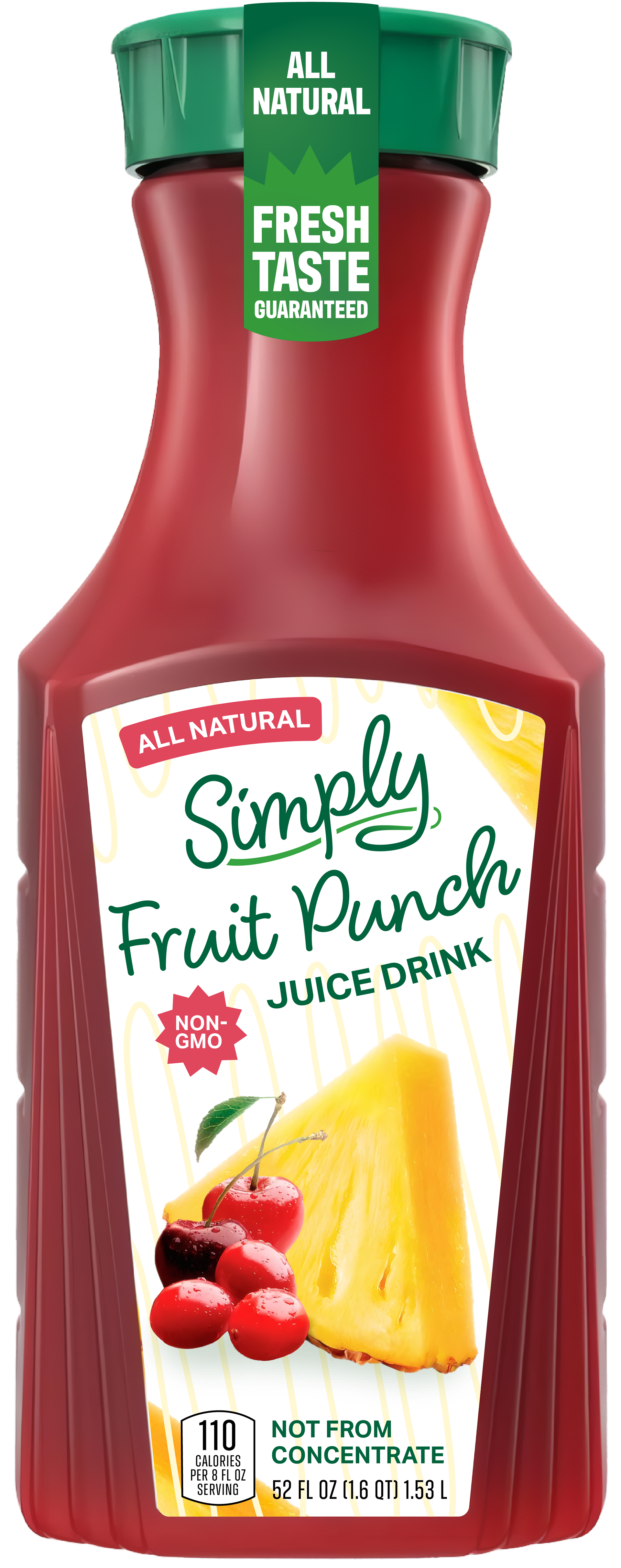
The Problem Child (Fruit Punch)
Now with two bottles done, you’d think this one would be easier… no! The fruit images on this one did not balance out space when scaled down, so I took to Photoshop to rearrange the pineapple and cherry/cranberries.
As I was inputting in the “Juice Drink” text, I wanted to differentiate it from how I did the “Raspberry” text as "Juice Drink" isn't a flavor, it was a type. So I gave a more plain approach and did green text with no colored background.
Original
Final
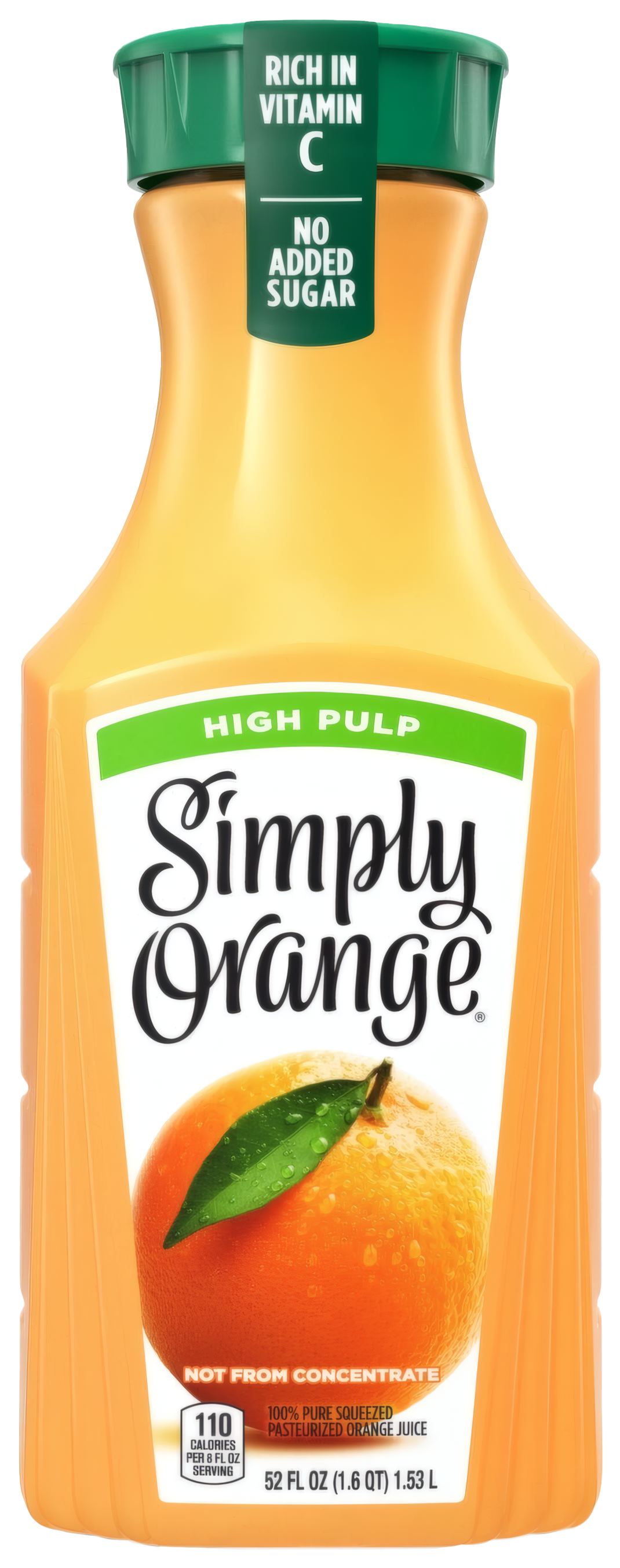
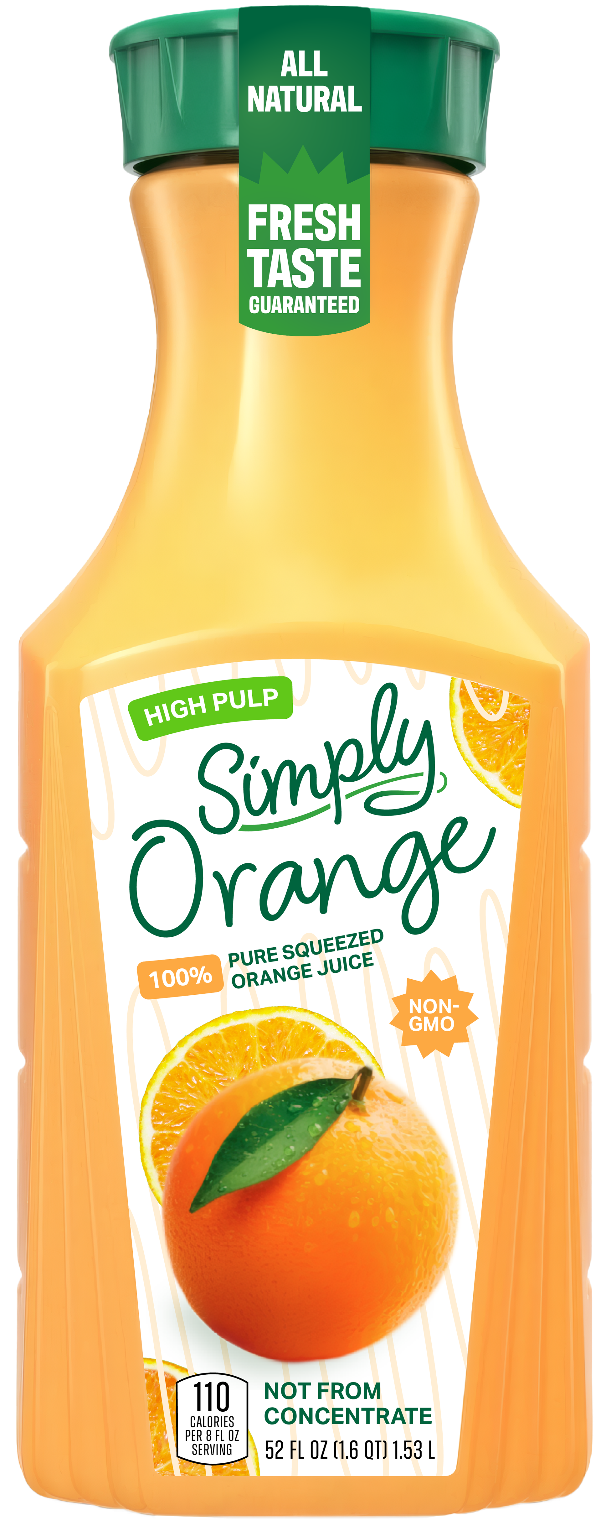
Orange you glad you read this far (Orange Juice)
The orange juice branding is a bit different from the other drinks with its specific factoids, so I embraced a slightly different layout scheme. For example, the “High Pulp” also had replaced the usual “All Natural” banner, which I ended up keeping, but I changed it to a green color and made my secondary label color orange.
Original
Final
The Final Lineup
With four bottle designs now created, here are my final designs: